SAVR
My Role
Duration
Tools
Figma
5 days
Design Strategy
Problem Solution
Visual Design
Competitive Research
Competitive Analysis
Sketch
Prototype
Usability Tests
Process
Overview
Savr, a recipe app, used a modified GV sprint to improve recipe instructions. While users liked the recipes, many found the steps unclear. The sprint focused on making cooking guidance easier and more confident.
Problem
Users struggled with unclear instructions and switching between devices while cooking. This caused frustration, mistakes, and wasted time. Savr needed a clearer, more seamless cooking experience.
Solution
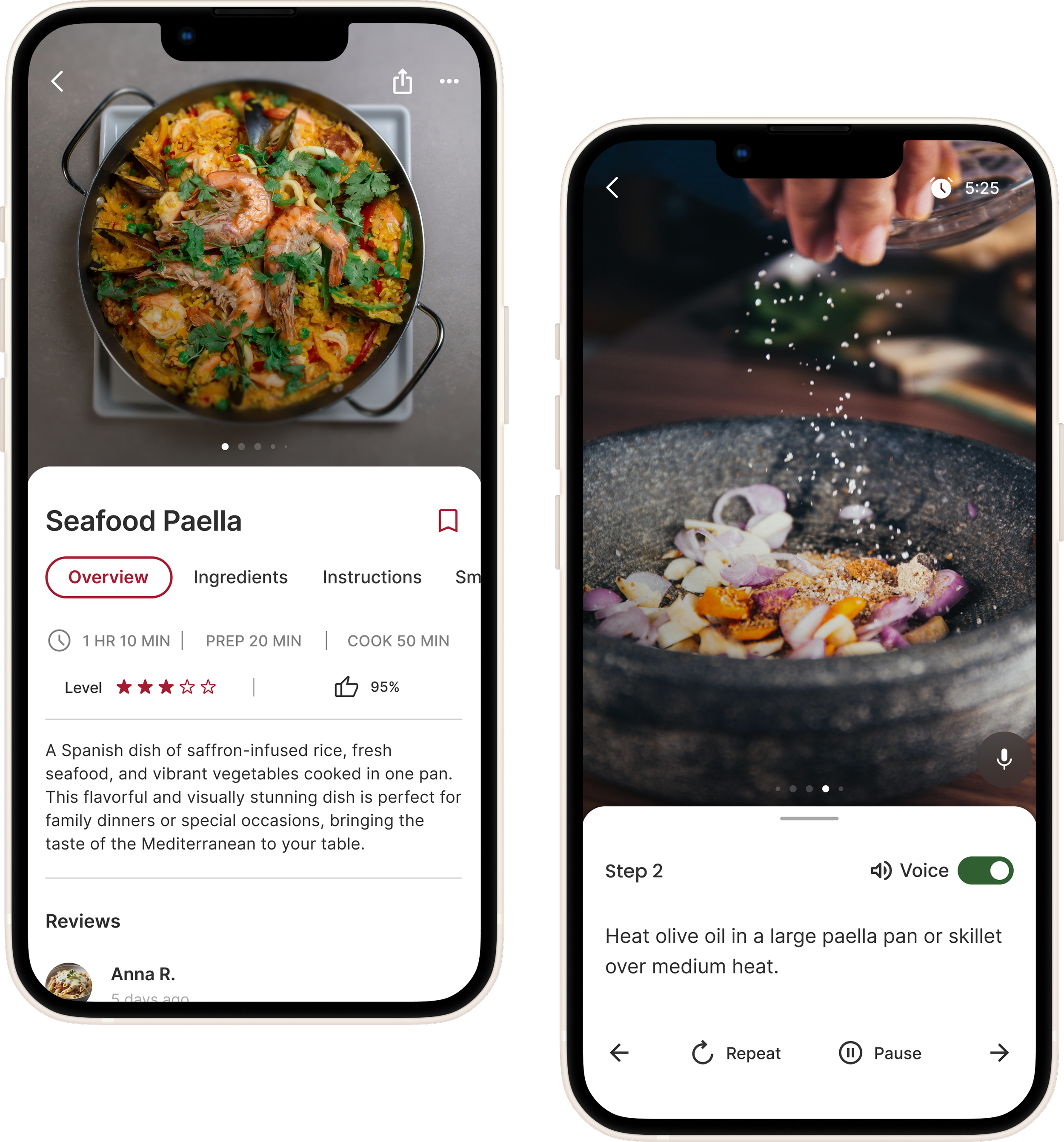
Add step-by-step images, videos, and optional audio to help users better understand and follow recipes with confidence.
Day 1: Understand & Map
I mapped the user journey to spot issues like unclear steps and tool-switching, and found clarity gaps through competitive analysis.
Competitive Analysis
Tasty makes recipes fun and easy to follow with videos, but lacks organization and step-by-step visuals in some cases.
Paprika offers strong planning tools but lacks visual guides like photos or videos.
Identifying gaps in guidance and instruction tools
Day 2: Sketch & Ideate
I used sketching and a Crazy 8s exercise to rapidly explore ways to combine visual, audio, and text instructions. This helped me visualize solutions and plan next steps.
Low-fidelity sketches showing recipe browsing, ingredients, and guided cooking flow
Day 3: Decide & Storyboard
I translated key ideas into quick sketches to visualize the user flow and core interactions for recipe browsing and step-by-step guidance.
Key Feature
Smart Cook: Voice-guided, hands-free mode for cooking.
Voice Guide: Ask questions during cooking.
Instruction Format: Choose between text, image, or Smart Cook.
Storyboard sketches illustrating the user journey of a recipe app
Day 4: Prototype
This mid- to high-fidelity prototype, created in Figma, demonstrates how Smart Cook supports different learning styles by combining voice guide, visual step-by-step guidance, and text instructions on the recipe screen.
Mid-fidelity wireframes refining the recipe and instruction flow
Day 5: Test
Five participants tested the prototype. While they liked the Smart Cook feature, they were confused about how it differed from voice guide.
Key Insights
80% found Smart Cook and Voice Assistance helpful.
80% were confused about the difference between Smart Cook and Voice Assistance.
60% preferred having access to traditional text instructions.
40% requested an ingredient checklist feature to track their progress.
High-fidelity screens showing key features
“It’d be nice to have a checkbox next to the ingredients so I can check which ones I have and which ones I need.”
Revision
Based on usability testing and user feedback, several key areas of the app were revised to improve clarity and usability.
Instructions
Smart Cook
Ingredients section
Interactive Prototype
Interactive prototype to show how users can track workouts, join challenges, create their own challenges with friends, and connect with the community.
Reflection
This project transformed my UX approach. Frequent testing and iteration revealed real user needs and shaped my decisions. By listening to feedback, I learned to design for diverse learning styles. Making the app more accessible strengthened both its usability and my dedication to inclusive design for future work.


